Your prototypes (photos and descriptions, before and after the evaluation)


Initial prototype — I was not totally satisfied with the initial prototype – I was shooting for a simplified version of a music-player application, without over-cluttered features, but my design ended up being pretty sloppy, having some really unclear functions as I was not decided on what features to implement.


Refined prototype — During the refining process, the home-page layout was changed a bit, especially the collapsable music-player, as in the initial prototype it occupied too much screen space. The music player button layout was changed as well in order to prevent accidental mis-clicks that were encountered in the testing process. Minor tweaks were made as well to improve the efficiency of the app.
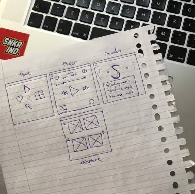
Refined prototype — The watch interface didn’t change a lot apart from the search page, which now offers the option to scroll through songs as well, as only having a voice search option was not efficient.
Explanation of how the prototypes were evaluated. Discuss if there were any problems in conducting the test.
In order to evaluate the paper prototype, a clickable version of it was quickly compiled using Marvel App during the class, after which I had different users try out the prototype and check out all the existing features. Besides the limitations of Marvel, the testing process went smooth and helped me gather insights about what elements of my design were subject to change.
One problem that some users hit was the fact that some of the pages that they were trying to access didn’t exist, which resulted in confusion – for example, I did not have an Artist page or an Album page, only a Now Playing page, so when the user tried to click on any song other than the currently playing one, the application did not allow them to.
Another problem I have discovered with my initial prototype’s button placement was not the best one I could have went with, as they were relatively close to each other and besides causing confusion, it also caused plenty of mis-clicks.
The findings from the evaluation by a fellow student and how you could use them to refine the prototypes.
- Homepage is too cluttered
- The music controls should not be visible on the homepage at all times.
- (remove permanent controls from homepage, transform them into a slider that pops up, which includes both album artwork and controls)
- The music controls should not be visible on the homepage at all times.
- Love function is confusing
- (there isn’t a “love” button, only an add to playlist button)
- (add “add to favourites” button)
- (there isn’t a “love” button, only an add to playlist button)
- Voice search isn’t always possible.
- Voice search shouldn’t be the ONLY way to search. (for the watch app)
- (add another way of searching – e.x. slider with letters )
- Voice search shouldn’t be the ONLY way to search. (for the watch app)
- “Add to playlist” button is too close to play button.
- Button can be misclicked.
- (change position of secondary controls so they’re not directly next to the primary music controls)
- Button can be misclicked.
